如何高效使用比例面积图-How To Use Proportional Area Charts Effectively
Most executives do not have time to decode your chart. If they have to think about what they are looking at, you have already lost a bit of credibility. That is where proportional area charts can be powerful. When used correctly, they make hierarchy and scale obvious in seconds. When used poorly, they distort reality and quietly undermine trust.
大多数高管没有时间去解读你的图表。如果他们需要思考图表内容才能理解,你已经失去了一些可信度。而比例面积图恰恰能解决这个问题。如果使用得当,它们可以在几秒钟内清晰地展现层级和规模;如果使用不当,它们则会扭曲事实,悄然损害信任。
There’s something about certain visuals that feel intuitive at first glance, but the more you stare at them, the less sense they make. And then there are charts that just click. You see the big circle next to three smaller ones and instantly get the story. That’s the power of a proportional area chart.
有些图表乍一看似乎很直观,但你越盯着看,就越觉得难以理解。而有些图表却能让人一眼就明白。你看到一个大圆旁边跟着三个小圆,就能立刻明白它的意思。这就是比例面积图的魅力所在。
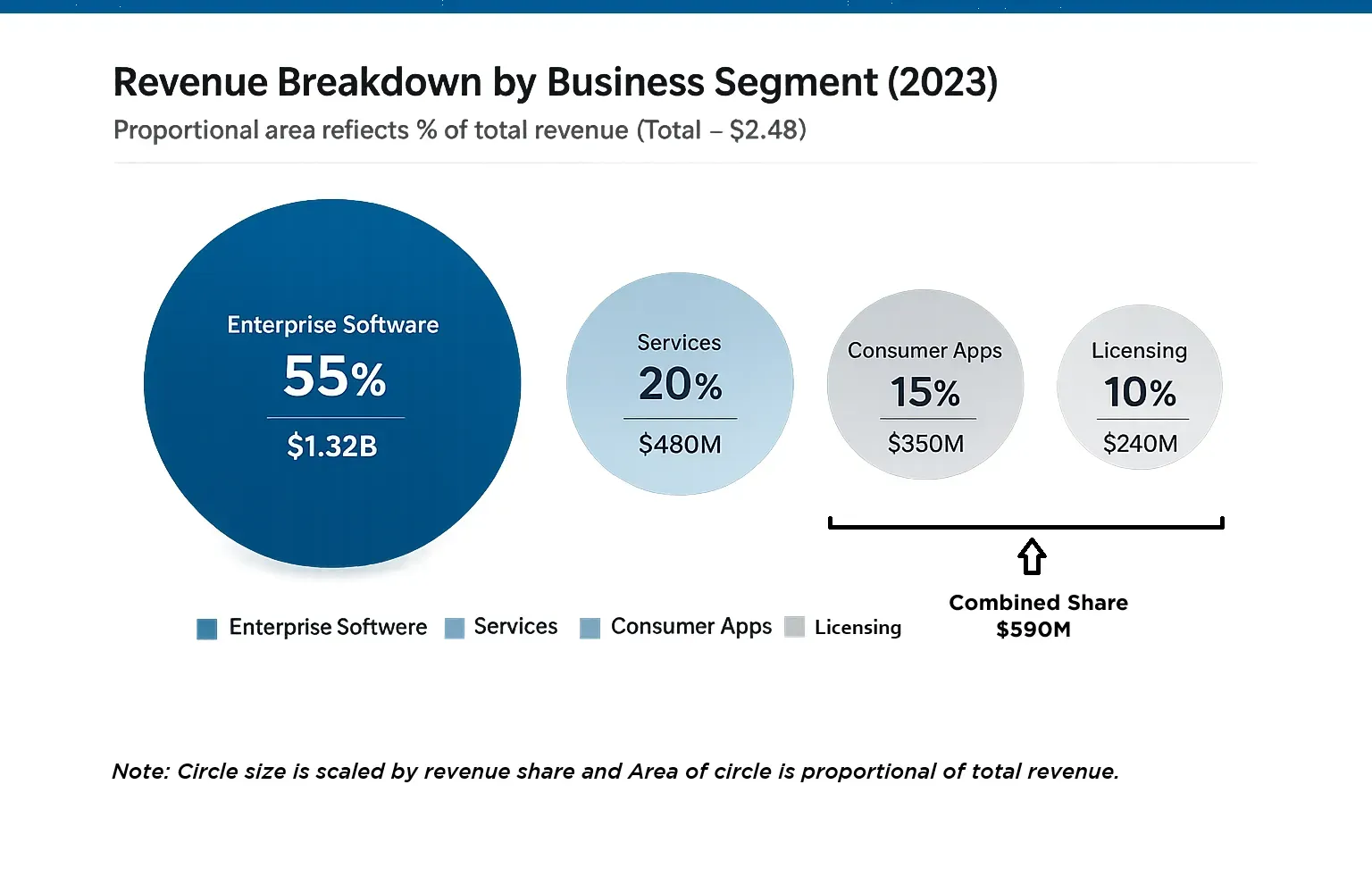
一个显示收入份额的比例面积图示例。
If you’ve ever tried to explain market share, revenue breakdowns, or population comparisons and felt like your bar chart wasn’t landing, this might be the visual you’re missing.
如果你曾经尝试解释市场份额、收入构成或人口比较,但感觉你的柱状图没有起到作用,那么这可能是你所缺少的视觉效果。
Let’s break down what they actually are, when they work in real business settings, and where they go wrong.
让我们来分析一下它们究竟是什么,它们在实际商业环境中何时有效,以及它们在哪些方面会出错。
What is a Proportional Area Chart?什么是比例面积图?
Section titled “What is a Proportional Area Chart?什么是比例面积图?”A proportional area chart represents values by scaling the area of a shape, usually a circle, so the size of the shape reflects the magnitude of the data. Not the height. Not the diameter. The full area.
比例面积图通过按比例缩放形状(通常是圆形)的面积来表示数值,因此形状的大小反映的是数据的大小,而不是高度或直径,而是整个面积。
If Business Unit A generates twice the revenue of Business Unit B, its circle should have twice the surface area. That does not mean the diameter doubles. In fact, doubling the diameter makes the area four times larger. That mistake is more common than most people realize.
如果业务单元 A 的收入是业务单元 B 的两倍,那么它的圆的面积也应该是业务单元 B 的两倍。但这并不意味着直径翻倍。事实上,直径翻倍会使面积增大四倍。这种误解比大多数人意识到的要普遍得多。
You will see proportional area charts referred to as bubble charts or scaled circle charts in Excel, PowerPoint, Tableau, and Power BI. The tools handle the math correctly, but manual resizing in PowerPoint often does not.
在 Excel、PowerPoint、Tableau 和 Power BI 中,您会看到比例面积图,它们通常被称为气泡图或缩放圆图。这些工具可以正确处理计算,但在 PowerPoint 中手动调整大小往往会导致问题。
In client work, that distinction matters. Once someone questions whether a visual is distorted, the conversation shifts away from insight and toward accuracy.
在客户工作中,这种区别至关重要。一旦有人质疑视觉效果是否失真,讨论的重点就会从洞察力转向准确性。
When Proportional Area Charts Work Best比例面积图何时最适用
Section titled “When Proportional Area Charts Work Best比例面积图何时最适用”Here’s the interesting part. Most people are wired to notice size differences instantly. A larger object grabs attention without us consciously thinking about it. That makes proportional area charts incredibly effective for emphasizing hierarchy and scale.
有趣的是,大多数人天生就能立即注意到尺寸差异。较大的物体会在我们不经意间吸引我们的注意力。这使得比例面积图在强调层级和规模方面非常有效。
Senior leaders process visuals differently than analysts. They scan for dominance. They look for imbalance. They want to see what stands out. Humans are naturally sensitive to size differences. Larger shapes attract attention immediately, even before we read labels. That makes proportional area charts useful when the goal is to communicate scale or hierarchy quickly.
高层领导处理视觉信息的方式与分析师不同。他们会快速浏览,寻找主导地位,关注不平衡之处,并希望看到最突出的内容。人类天生对尺寸差异非常敏感。较大的图形会立即吸引注意力,甚至在我们阅读标签之前就能注意到。因此,当目标是快速传达规模或层级关系时,比例面积图就非常有用。
For example:例如:
If one product line represents 60 percent of total revenue, a single dominant circle beside several smaller ones communicates that reality instantly.
如果一条产品线占总收入的 60%,那么一个占主导地位的圆圈旁边几个较小的圆圈就能立即传达这一事实。
If one customer segment generates triple the lifetime value of others, the oversized bubble becomes the conversation. In board discussions where time is limited, this kind of immediate visual hierarchy reduces friction. The audience does not have to interpret angles, scan multiple bar lengths, or compare small differences across categories. The message surfaces faster.
如果某个客户群体的终身价值是其他群体的三倍,那么这个超大的气泡图就成了讨论的焦点。在时间有限的董事会讨论中,这种直观的视觉层级结构可以减少沟通阻力。听众无需解读角度、浏览多个柱状图的长度,也无需比较不同类别之间的细微差别。信息能够更快地呈现。
When Should You Use a Proportional Area Chart?何时应该使用比例面积图?
Section titled “When Should You Use a Proportional Area Chart?何时应该使用比例面积图?”Proportional area charts are not universal. They work best in specific scenarios. They are effective when you need to show relative scale across a limited number of categories, usually five to seven at most.
比例面积图并非万能,它们在特定情况下效果最佳。当需要展示有限数量类别(通常最多五到七个)的相对比例时,它们非常有效。
Common use cases in consulting and strategy work include:
咨询和战略工作中的常见应用场景包括:
-
-
- Market share comparisons when one or two players clearly dominate.
当一家或两家企业明显占据主导地位时,市场份额比较如何进行?- Revenue or profit breakdowns where the goal is to emphasize concentration risk.
以收入或利润细分为目标,强调集中风险。 - Portfolio overviews where a few assets drive most of the value.
投资组合概览,其中少数资产创造了大部分价值。 - Customer or segment comparisons when highlighting outliers.
在突出显示异常值时,进行客户或细分市场比较。
- Revenue or profit breakdowns where the goal is to emphasize concentration risk.
- Market share comparisons when one or two players clearly dominate.
-
They are particularly strong when the story is about magnitude, not precision.
当故事讲述的是宏大的场面而不是精确的细节时,它们尤其具有力量。
If the difference between two categories is small, a bar chart is often clearer. But if one category materially outweighs the others, area communicates that imbalance quickly.
如果两个类别之间的差异很小,柱状图通常更清晰。但如果一个类别明显大于其他类别,面积图则能迅速传达这种不平衡。
Common Mistakes That Undermine Credibility损害信誉的常见错误
Section titled “Common Mistakes That Undermine Credibility损害信誉的常见错误”There are three recurring issues that show up in real presentations.
实际演示中经常会出现三个问题。
The first is incorrect scaling. When someone resizes shapes manually based on intuition instead of math, differences become exaggerated or understated. Executives may not calculate the distortion, but they often sense when something feels off.
第一种情况是缩放比例错误。当人们凭直觉而非数学计算手动调整图形大小时,差异会被夸大或低估。高管们可能不会计算这种失真,但他们通常能感觉到哪里不对劲。
The second is too many categories. Once you move beyond seven data points, the chart becomes cluttered. Small circles are hard to label and the visual impact weakens.
第二点是类别过多。一旦数据点超过七个,图表就会显得杂乱无章。小圆圈难以标注标签,视觉冲击力也会减弱。
The third is overstating small differences. A shift from 35 percent to 40 percent can look dramatic in area form even though the underlying difference is modest. Without clear labels, the visual can imply more separation than actually exists.
第三种情况是夸大微小差异。例如,从 35%到 40%的变化,即使实际差异很小,在面积图中看起来也可能非常显著。如果没有清晰的标签,这种视觉效果可能会给人造成比实际更大的分离感。
This is where good slide structure matters. The title should clarify the intended message so the chart does not over-suggest.
良好的幻灯片结构在此至关重要。标题应清晰阐明想要传达的信息,避免图表表达过度。
Design Principles That Make Them Work使它们有效运作的设计原则
Section titled “Design Principles That Make Them Work使它们有效运作的设计原则”If you decide to use a proportional area chart, a few discipline rules help.
如果您决定使用比例面积图,一些纪律规则会有所帮助。
-
-
- Limit the number of categories. Five is often ideal.
限制类别数量。五个类别通常比较理想。- Label every shape clearly with actual values or percentages. Never rely on area alone for precision.
务必用实际数值或百分比清晰标注每个图形。切勿仅依赖面积来保证精度。 - Keep the design minimal. Avoid shadows, gradients, and decorative elements. Clean circles with restrained color work best in professional settings.
设计应保持简洁。避免使用阴影、渐变和装饰元素。简洁的圆形搭配克制的色彩,最适合专业场合。 - Use color intentionally. Highlight the dominant category in a primary color and keep the rest neutral if the story is about concentration.
有意识地运用色彩。如果故事的主题是专注力,那么用主色调突出主要类别,其余部分保持中性。 - Most importantly, frame the slide with a clear takeaway. A headline like “Enterprise Segment Drives Majority of Profit” guides interpretation better than a generic title like “Profit Breakdown.”
最重要的是,幻灯片的标题要清晰明了,突出重点。像“企业业务板块贡献了大部分利润”这样的标题比“利润构成”这样的通用标题更能引导观众理解。
- Label every shape clearly with actual values or percentages. Never rely on area alone for precision.
- Limit the number of categories. Five is often ideal.
-
The chart supports the message. It should not force the audience to guess the message.
图表旨在辅助传达信息,不应让观众猜测其含义。
Final Thought 最后想说
Section titled “Final Thought 最后想说”Charts are not decoration. They shape how people interpret reality. A well-built proportional area chart can make hierarchy obvious in seconds and anchor a discussion around what truly matters. A poorly built one can quietly distort perception and erode trust. The difference is not in the tool. It is in the discipline behind the design.
图表并非装饰品,它们塑造着人们对现实的解读。一张精心制作的比例面积图能够瞬间展现层级关系,并将讨论聚焦于真正重要的问题。而一张粗制滥造的图表则会在不知不觉中扭曲人们的认知,侵蚀信任。关键不在于工具本身,而在于设计背后的严谨性。
If your goal is clearer, more persuasive communication, the chart type is only the starting point. The structure of the message always comes first. Check out our courses to know more about how to create an engaging and more effective presentations.
如果您的目标是实现更清晰、更具说服力的沟通,那么图表类型仅仅是起点。信息结构始终是首要考虑因素。欢迎查看我们的课程,了解更多关于如何制作引人入胜、更有效的演示文稿的信息。